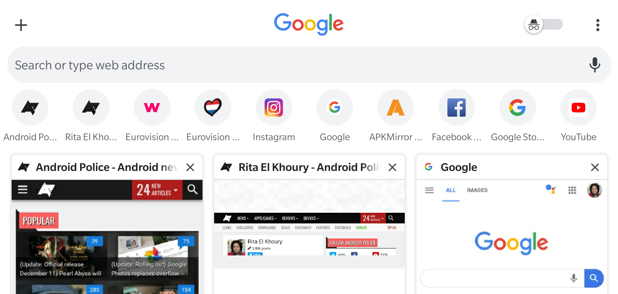
Chrome is in a perpetual interface test. Every few weeks, we discover a new flag that turns things around like putting the URL bar at the bottom or eschewing the large tab cards for a smaller grid tab switcher. Google seems ready to settle on the latter as the latest Chrome Dev and Canary use this as the default layout but with a busier look that mashes elements from the new tab page into the tab switcher, with lots of icons, bars, and toggles.
Read MoreChrome testing busy grid tab switcher with Incognito toggle, search bar, and site shortcuts was written by the awesome team at Android Police.
Android Match


Post a Comment