![]()
Twitter can't seem to decide how to best present Moments. Late last year, Moments started showing up as vertically-scrolling lists, a less attractive but more functional layout. Now, they're back to a horizontal, card-style layout.
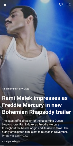
Twitter Moments back at it with the horizontal cards.
We're seeing the behavior on both version 7.54 and beta version 7.55 of the Twitter app. The change is especially odd considering Twitter announced last month that Moments would be arranged vertically going forward — and that their research showed that the vertical layout led to more user engagement.
Read MoreTwitter Moments revert from vertical layout to card-like interface was written by the awesome team at Android Police.
Android Match


Post a Comment